Sunday, 1 December 2013

Foundling Museum

The final weekly lecture before the Christmas holidays, linked back to all the lectures we previously had throughout term. We were asked to visit the Foundling Museum - a hospital which was London's first home for abandoned children. The museum was restored and refurbished and built adjacent to the site of the original Hospital.

When I visited, I looked around at the various exhibitions, comprising of modern art from today and traditional paintings that were donated as part of the hospital art collection in the 18th century, where it became a public gallery. Where as the 18th century paintings make the story of the Foundling honest and real, the modern art acts as more of an interpretation.

An intriguing piece of art donated to the museum is Tracey Emin's bronze cast - 'Baby Things, Mitten', found on the railings outside the museum.


I think the representation of the mitten is bittersweet. On the one hand, it's symbolic of loss and abandonment - perching on the fence as a disowned object. Nevertheless it sits there poised and hopeful of a better future. A mitten provides warmth and protection from the outside, which is essentially what the Foundling offered - a shelter and safe haven for abandoned children. The charity still continues to care for children today.

Thursday, 28 November 2013

Drawing Week 3: Big, Lidl, Henry VIII with Will Stevens

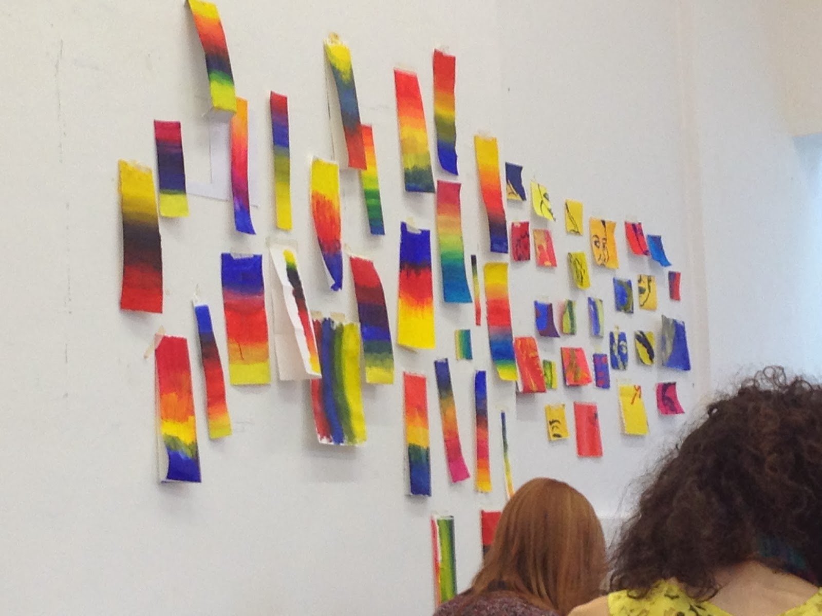
Will's second drawing session continued with the portraiture theme from the previous day with John Bentley. Nevertheless, the focus of this session was on primary colours. First we did some painting exercises looking at the 3 primary colours. To begin with, we had to split our paper into 6 and paint each square in the primary colours; 2 of each colour. Then we had to paint a portait of someone using an opposing colour on each square. It was interesting to see how the colours work together. I think it looks really striking and vivid.


For the second exercise we created a colour gradient which went from red to yellow to blue with each blending into one another. In this situation, we were focusing on the transition from one colour to the next, which was also really interesting.


The third exercise introduced the Lidl bag which utilises the 3 primary colours. Again we painted the same portrait from the first exercise onto the Lidl bag. The colours interacted with the background in an unusual yet harmonious way.

For the final exercise, we were split into 3 groups and each given a pile of Lidl carrier bags. We had to recreate the same portrait of Henry VIII using the Lidl bags. As you can see, each were different but bright, playful and full of character. I really enjoyed this drawing session. It really made you consider the use of the primary colours.


Wednesday, 27 November 2013

Drawing Week 3: A Giant Portrait of the Queen with John Bentley

For this drawing session, we were each given a tiny square which was a section of one photograph. We each had to do an enlarged drawing of our square onto an A1 sheet of paper. The final drawings were all fitted together like a jigsaw and the result was one massive portraiture of the Queen. It looked great when it was finished!


Tuesday, 26 November 2013

Drawing Week 3: Collage with Chetna

In this session, we created collages using photocopies of our objects and focusing on a word we were given. My word was 'hybridisation', and I incorporated this by revealing and overlapping the photocopied objects into the collage so that they appeared to be mixing, cutting in and merging, as though creating a hybrid.

The collages were really fun and experimental and I think the outcomes were successful. The varying materials provided interest and a mixture of textures. I particularly like this first collage because it's well though out - it hybrids the red acrylic with the coloured objects and the coloured splodges on the opposite side to create a mirrored, asymmetrical, juxtaposing composition.


Sunday, 24 November 2013

Technical Block 2: Print - Photoshop Prints

For digital print, we scanned in all the drawings we had made prior to Print in the drawing weeks. These were then manipulated in Photoshop to create our own digital prints. Since I'm fairly inexperienced in Photoshop, I just focused on the basics and concentrated on colour, scale, repeat, overlaying and creating textures and patterns. It was fun to play around and really useful to learn Photoshop skills. These were some of prints I created...


Saturday, 23 November 2013

Technical Block 2: Print - Screen Printing

When we began screen printing, the first step was to pin the silk down to the surface and ensure it was completely stretched out and well pinned down.

Then we were shown how to make the dyes. Because we were using silk which is a natural material known as a protein fiber, we had to prepare acid based dyes which soak into the fibers of the material.

Once the dyes were prepared we were ready to begin screen printing. The stencils were fixed to the screen, and then the dye was pulled through the screen using a squeegee. This process was a little bit stressful and messy. The stencils were only usable for around 2 goes and then the screen had to be thoroughly cleaned and dried before it could be used again. Furthermore, there was a lot to consider in terms of colour, arrangement and most importantly layering. It was important to be one step ahead - considering how it will look, because you can only tell once it's been printed and you can't reverse the process. Nevertheless, I think I created some fairly successful prints, some better than others. The ones that worked most successfully were well layered and balanced in terms of pattern, colour and composition arrangement. I think the highlight of my prints was the colour palette which was exciting and vibrant. It was useful having primary colours in the palette since these worked well when layering up and working on top of a print.

Screen Printing
Final 6 prints

Friday, 22 November 2013

Technical Block 2: Print - Stencils

To begin the Print Technical Block, we prepared stencils to be used for screen printing. We referred back to the drawings we did with Kathy since they were quite abstract and shape based. These were turned into stencils and cut out of newsprint. It was important to consider shape, scale, placement on the newsprint and pattern. We were told to consider, if we were to make a pattern for a top, how would we want it to look? The stenciling was a fairly long process, but one which I quite enjoyed. I created a large variety of stencils so that I had a lot to choose from when it came to screen printing.

These were some stencils that weren't used in the end. I retained the extra cut out pieces because they could be used as an inverse print.
These were some of stencils I just about managed to retain and mount.